SwiftUI - iOS 14 的新元件 Label 和 LabelStyle
本文使用環境或工具版本
Xcode12.0
Swift5.3
SwiftUI2.0
圖示 + 文字 的組合不斷在 UI 裡面出現,像是官方設定裡面的項目,像是 TabBar 那樣上圖示下文字的模式,又或是像是 #nikerunning 那樣左圖示右數值的呈現方式。
在過去我們需要自己組合 UI,不過從 iOS 14 開始之後,我們就可以用 SwiftUI 新的 Label 元件來快速達成,同時還可以用 LabelStyle 來封裝排版與設計。
過去的時代
像是這樣的 UI
必須要這樣做
1 | HStack { |
Label
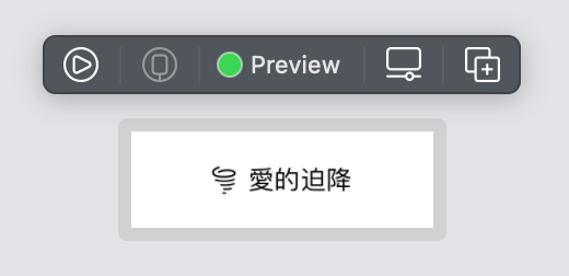
不過自從有了 Label 之後,只要這樣子寫,就可以有一樣的效果
1 | Label("愛的迫降", systemImage: "tornado") |
LabelStyle
LabelStyle 是一個 protocol ,方便我們自行宣告自己想要的排版和風格。
使用的時候,則是在 Label 後面接上 labelStyle(_:) 這個方法,傳入 label style 即可
原生的 LabelStyle
Apple 提供了非常基本的樣式:
- DefaultLabelStyle - 預設的左圖示、右文字的樣式
- IconOnlyLabelStyle - 僅顯示圖示
- TitleOnlyLabelStyle - 僅顯示文字
動手寫 LabelStyle
由於官方並沒有提供垂直 layout ,於是就以這個為範例做做看。
- 實作 LabelStyle 時,需要實作
makeBody(configuration:) - 可以從 configuration 取得 icon 和 title ,並向一般的 SwiftUI View 一樣設定各種風格
像是這樣,把他們裝進一個 VStack 就可以讓他們垂直排列了:
1 | struct VerticalLabelStyle: LabelStyle { |
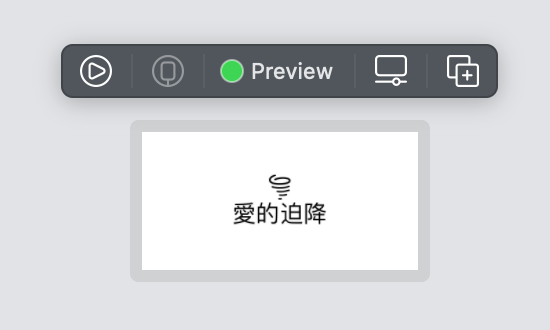
接著用在原先的 Label 套用這個風格
1 | Label("愛的迫降", systemImage: "tornado") |
看起來像是這樣
加上一些樣式看看
稍微調整一下 icon 和 title 的樣式:
1 | struct VerticalLabelStyle: LabelStyle { |
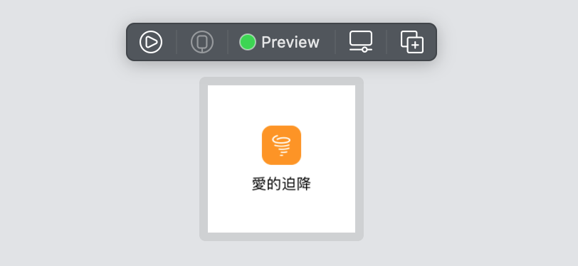
初始化的地方多了一個參數,因此來多加個橘色
1 | Label("愛的迫降", systemImage: "tornado") |
外觀就變成這樣:
以上!
還有其實愛的迫降我還沒看完 XDDDDDD